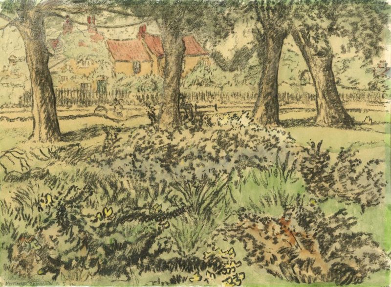
| Title | Mitcham Common |
| Artist | John Doman Turner |
| Date | 11th May 1912 |
| Medium | Watercolour |
| Dimensions | 28.1 x 38.1cm (11.1″ x 15″) |
| Distinguishing marks | Signed ‘J Doman Turner’. Titled ‘Mitcham Common’. Date inscribed ’11 5 1912′. |
| Collection | Private collection |
| Exhibitions | Camden Town Group 1912 third exhibition |
| Source | Featured in Camden Town Group third exhibition catalogue: https://www.tate.org.uk/art/research-publications/camden-town-group/the-third-exhibition-of-the-camden-town-group-r1104604 |
John Doman Turner painted this watercolour on the 11th May 1912 in Mitcham Common, London.
We believe this was the ‘Mitcham Common’ that was later exhibited at the Camden Town Group’s third exhibition at the Carfax Gallery in 24 Bury St, St. James’s, London in December 1912.
The Times reviewed the exhibition on the 19th December 1912…
“One cannot say of the Camden Town Group that they have anything in common, except the Carfax Gallery in which they exhibit. Some of them are influenced by Mr. Walter Sickert, their most distinguished member; but one, Mr. Wyndham Lewis, is a cubist, and his “Dance” [sic] seems to belong to a different world from all the other pictures in the room. We feel that it might be quite intelligible to the man in the moon, that it is indeed intelligible to Mr. Wyndham Lewis. For, though we see no dance in it, we do see a kind of geometrical logic in the design, which gives us more pleasure than we get from a quite commonplace and intelligible picture. But whether this pleasure would increase or disappear if we lived with the picture and whether it would gradually become intelligible we cannot tell. We only know that we like this better than most cubist pictures; but one cannot like a picture very much if one does not know what it represents.
Some of the other members of the Group are inclined to an irrational brightness of colour. We say irrational, not because the colour is brighter than it could be in reality, but because colour should always express a mood and because the colour in those pictures seems too bright for the mood otherwise expressed in them. There is nothing otherwise exultant, for instance, in Mr. Ginner’s “Piccadilly Circus,” in Mr. Drummond’s “St. James’s Park,” in Mr. Bevan’s two pictures of horses, or in Mr. Gilman’s “Reapers”; yet in all of these pictures the colour would suit only a most exultant mood, and a design and execution equally expressive of such a mood. Thus one feels that the colour is incongruous and imposed upon the picture for its decorative effect. It is in fact nothing but a new kind of prettiness, which would tire us as soon as it ceased to surprise. All of these artists do better when their colour is quiet, and Mr. Gilman’s “Porch” and Mr. Ginner’s “Rain on the Hill” are very pleasant pictures.
Mr. Sickert’s colour is perfectly suited to his mood. If it is a little grimy in his “Summer in Naples,” so is the mood. But the picture is not depressing, because it expresses a disinterested curiosity about the people represented which communicates itself to the spectator. We wish that Mr. Sickert’s execution did not half obscure his picture; but at the same time we feel that it is not obscuring a mere commonplace in the hope that we shall not detect it. It is all an effort at expression, not quite successful but quite sincere. Mr. Bayes’s “Port” reminds us of Nicholas [sic] Poussin, but is not a mere scholastic imitation. There is some incongruity between the homeliness of the background and the majestic figures, but none between the colour and the grandeur of form at which the artist aims. In his other works the colour again seems to us too bright, or perhaps too pretty for the sharpness of the forms. Mr. Lucien Pissarro is not quite at his best in any of the pictures which he shows, though the snow-piece is very vivid. Mr. J. B. Manson’s “Little French Harbour,” Mr. Gore’s “Letchworth Common,” and Mr. Doman Turner’s water-colour “Mitcham” are all very pleasant pictures. Indeed, the level of the exhibition is unusually high. In the same gallery there are some paintings and drawings by Mr. C. F. Winzer, most of which are rather vague fantasies in colour, without enough clearness of design to make them interesting. One feels that the artist has trusted too often to chance for his effects; but the “Merry-go-round” is amusing, and there is some character in the picture called “Parte de Sombra.”’
Source: The Times, 19-12-1912
Influences
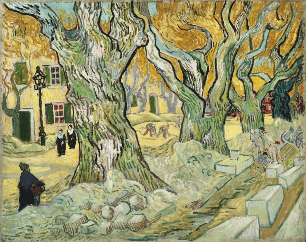
It looks like the works of Vincent Van Gogh may have inspired John Doman Turner. ‘Mitcham Common’ appears to be similar to ‘The Road Menders‘ painted in 1889.
In particular, the four trees are spaced out in a similar way, and the dark passages might be the catalyst that made this work a bit different from Doman Turner’s usual style. The small figure of a girl with a hoop in the background, which can not be seen that well (in Turner’s watercolour) is very similar to Van Gogh’s figures.
Related posts
https://johndomanturner.com/the-third-exhibition-of-the-camden-town-group-tate/
| Help us complete our research on John Doman Turner. If you know anything about this work, recognise the exact location or spot any errors, please do contact us and let us know. |

Leave a comment